Swipe Night
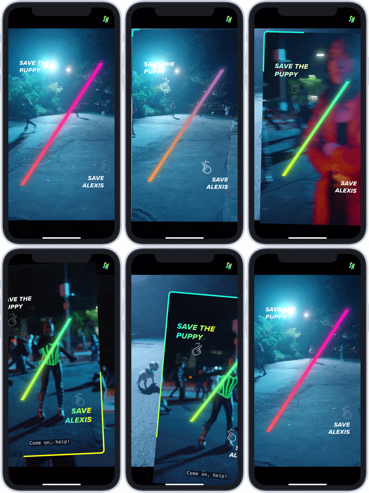
Swipe Night is an interactive first-person choose-your-own-adventure style event where Tinder users are prompted with moral dilemas and practical choices, to determine the direction of the story within the app. After each episode, users critical choices will be shown on their profile — Did you save the puppy or the person? As lead designer on the feature, I worked with the team to ship Swipe Night in just 6 months.
Tinder Places
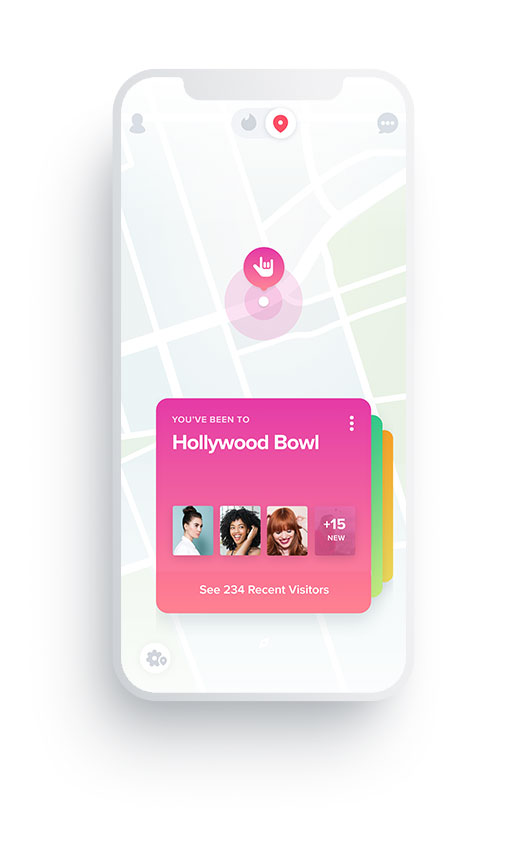
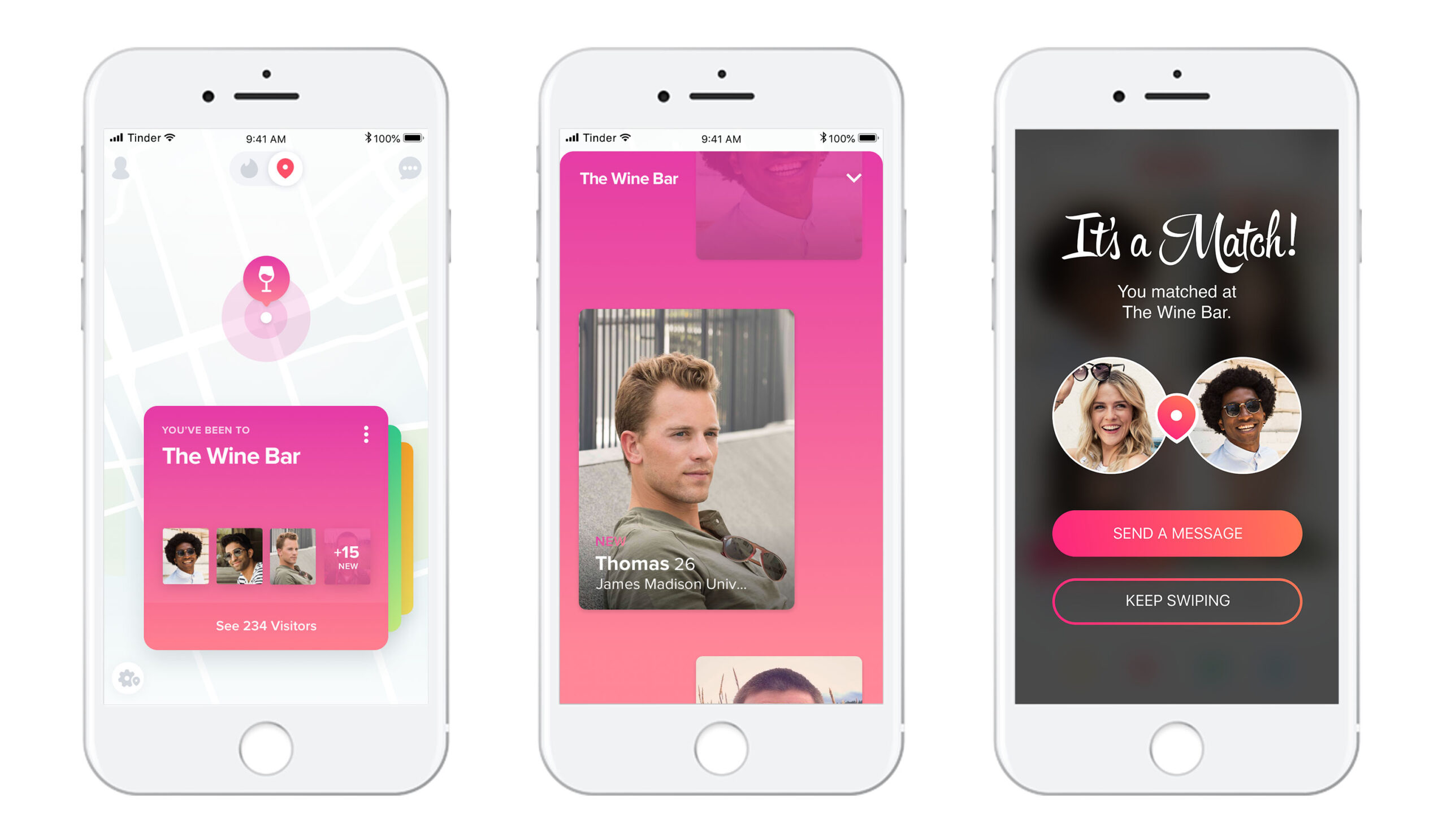
Tinder Places was an interactive map feature that used your location data to connect with potential matches who love the same spots as you do. To keep our user's privacy safe we made sure to not have it in real time and easily allow opting in or out. We partnered with Mapbox and Foursquare to bring the experience to life. I designed the experience from end-to-end. Watch the demo here.
Tinder 2.0
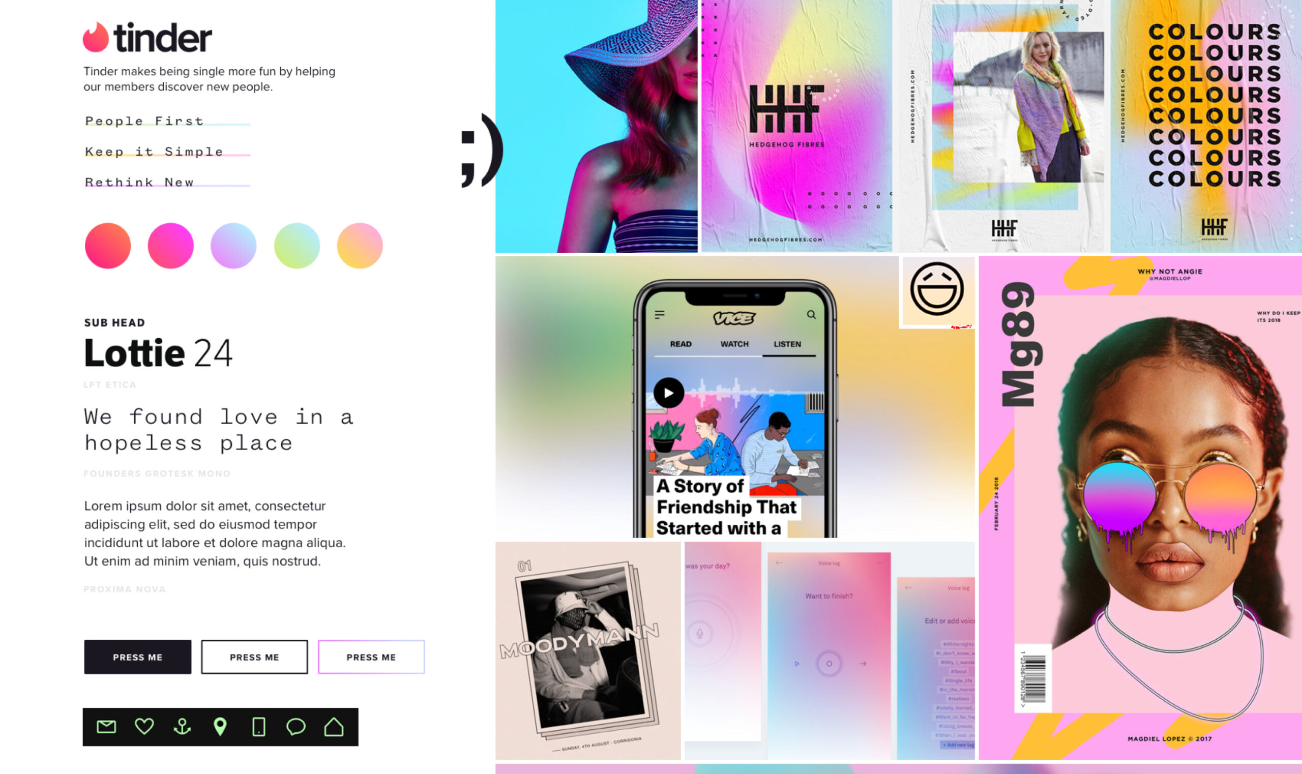
Tinder 2.0 was a design sprint put in place to push the future vision of tinder. With a small team we conducted brand voice excercises, moodboarding, prototyping and concepting solutions that satisfied our new brand vision. We followed the google design sprint method laid out in the book, "Sprint". Learn more about the process here.
Web App
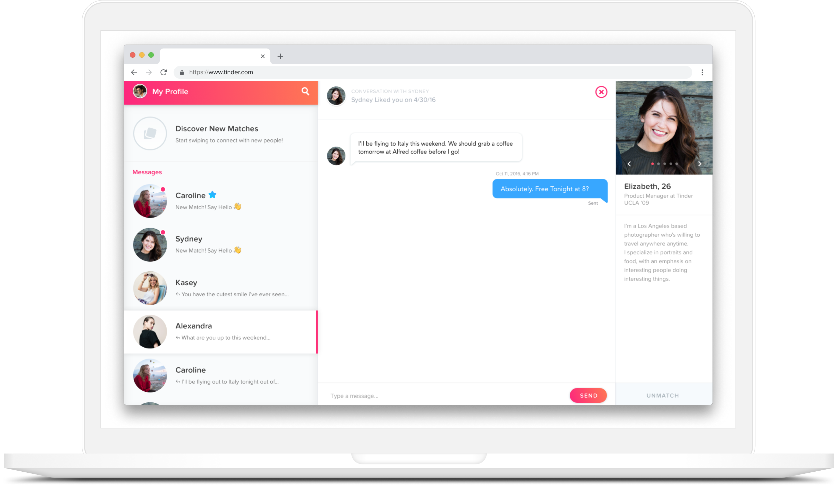
One of my first projects at Tinder involved building a progressive web app, so that users were able to swipe anywhere — on any device. The initiative began so that Tinder could expand to other markets, to make Tinder more accessible for users with poor service. We could cache matches and users could even swipe offline! We further polished the experience after traveling to Brazil and learning from our userbase on the ground.
